Branding Turismo |
A Síntese Visual da Experiência no Tocantins
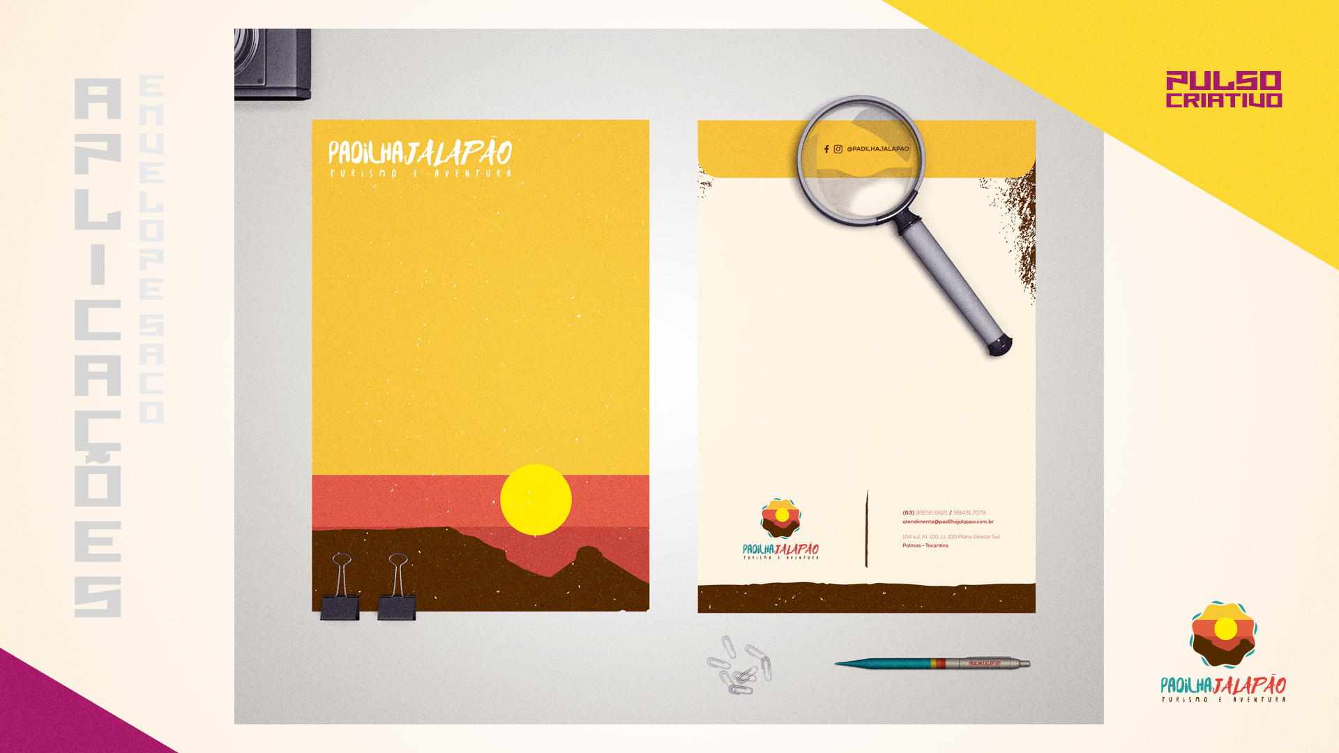
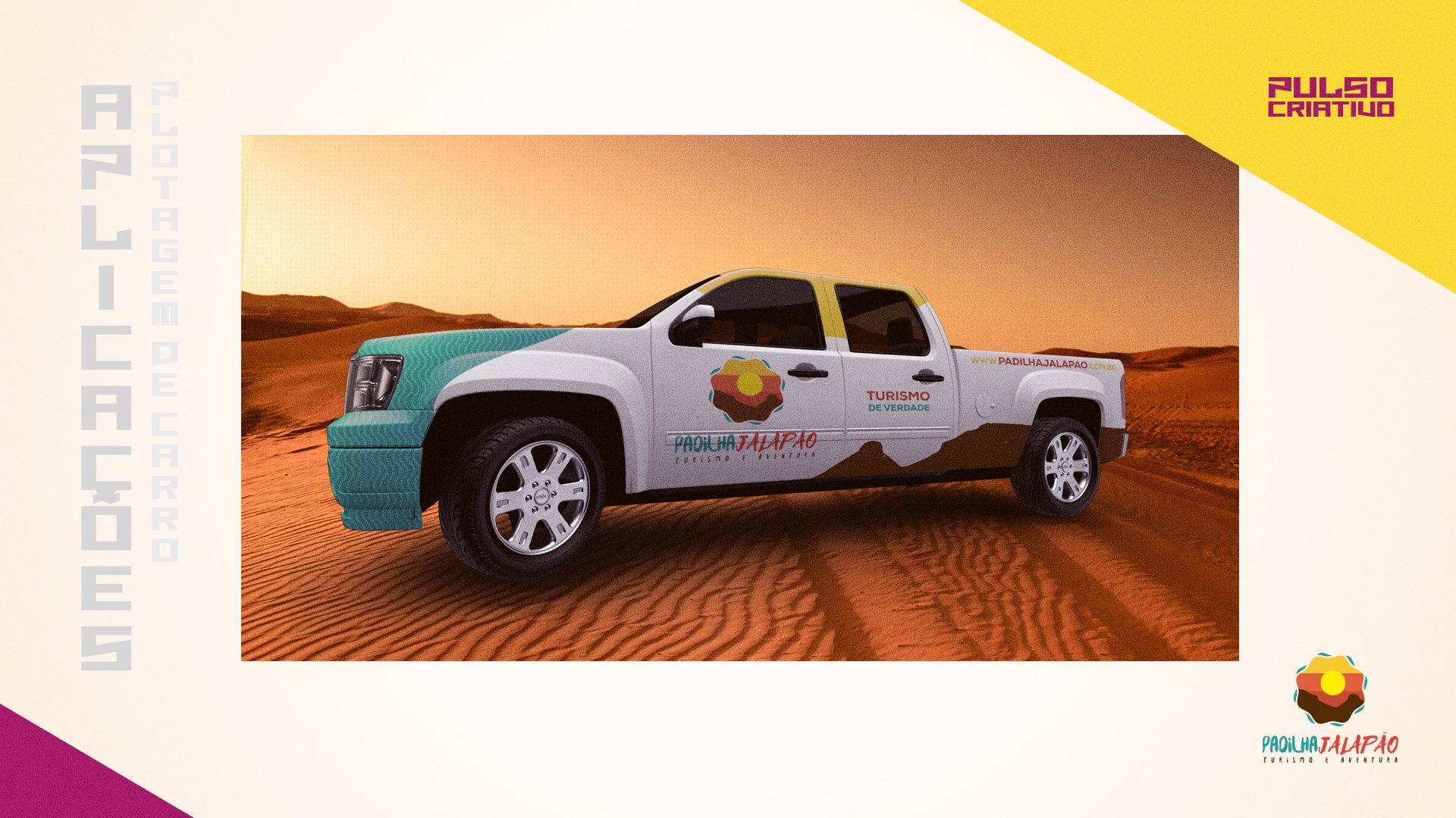
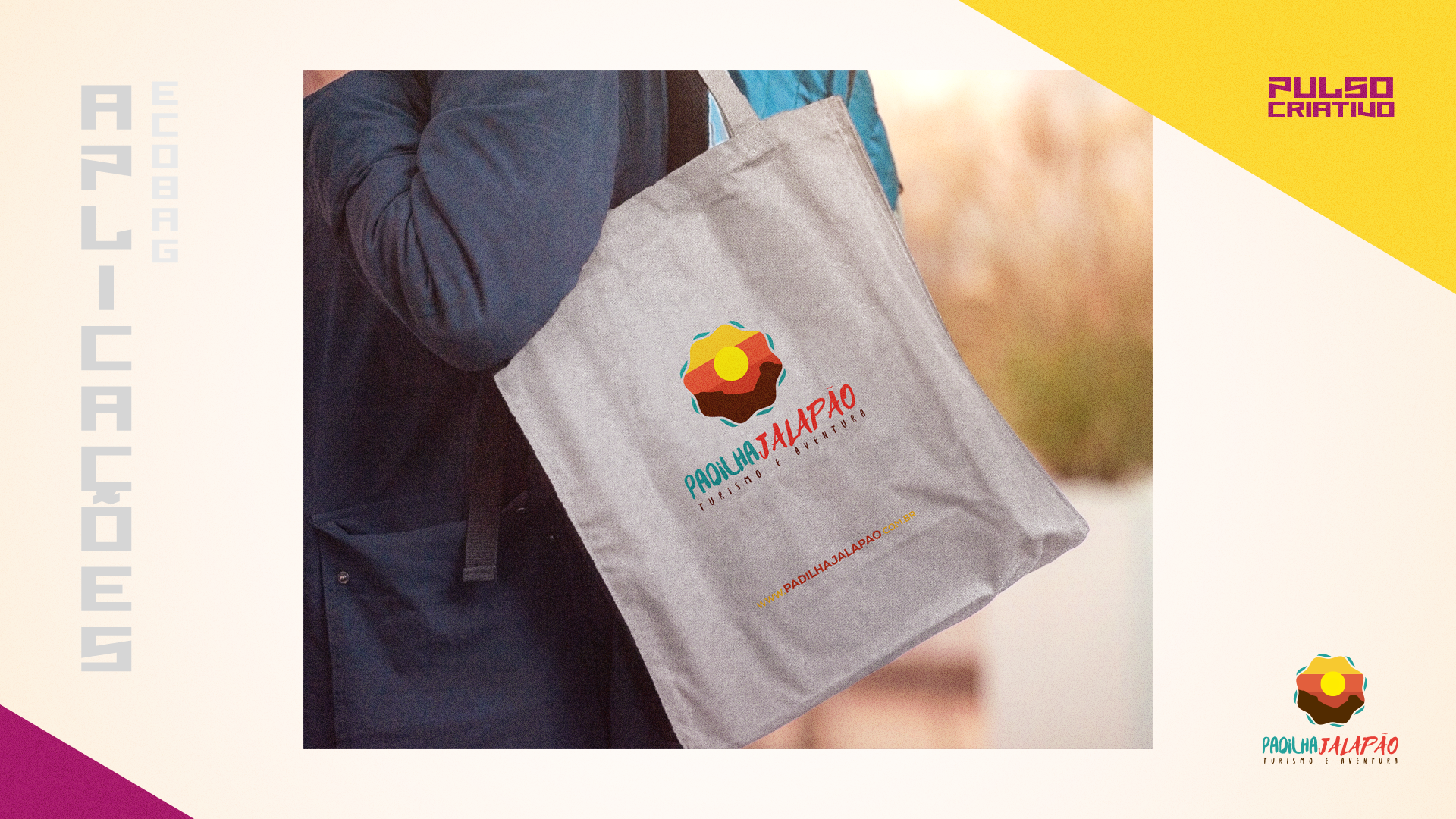
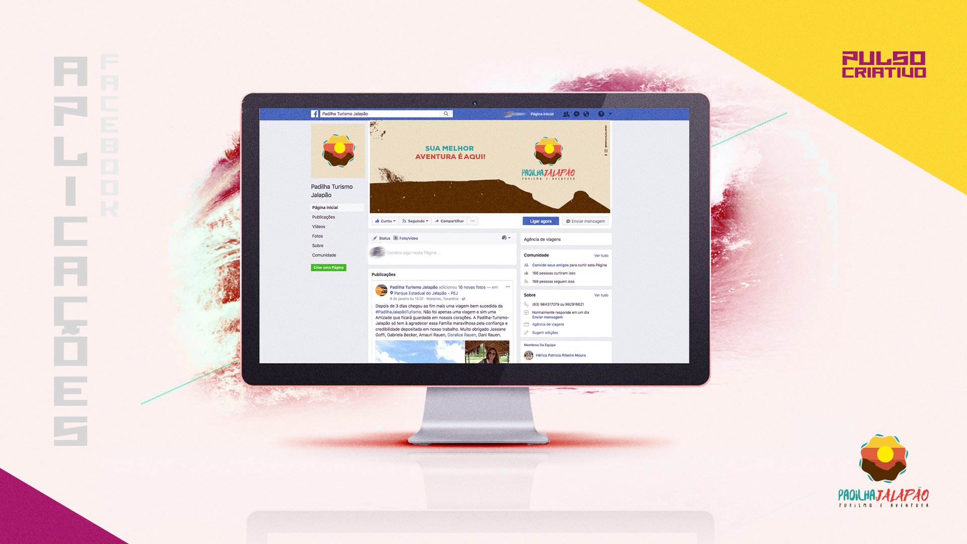
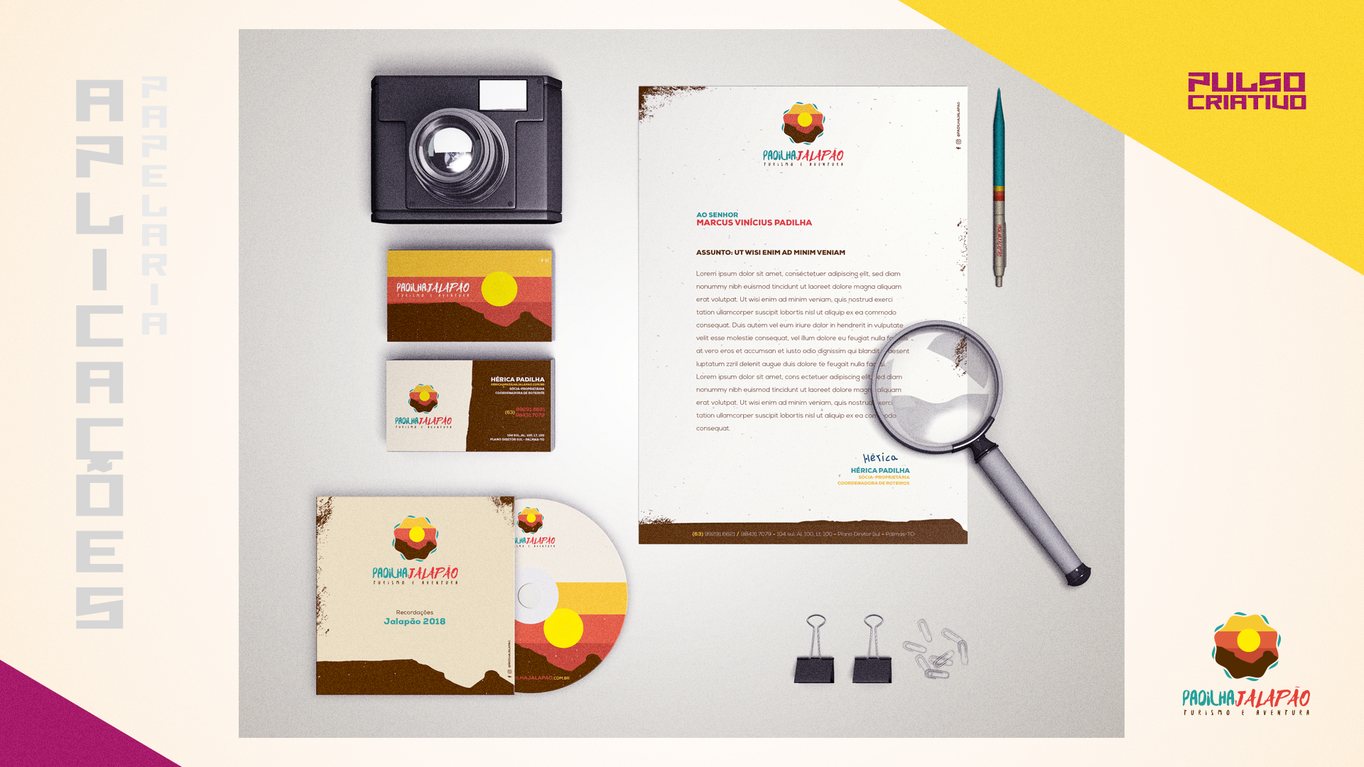
Branding _ Papelaria _ Envelopamento
O Desafio
O Jalapão é um território de contrastes: o calor das dunas, o frescor dos fervedouros e a solidez das chapadas. O objetivo foi criar uma identidade para a Padilha Jalapão que transmitisse a emoção do ecoturismo sem abrir mão da segurança e da autoridade institucional necessária para guiar aventureiros por esse ecossistema único.
O Conceito: O Sol como Bússola
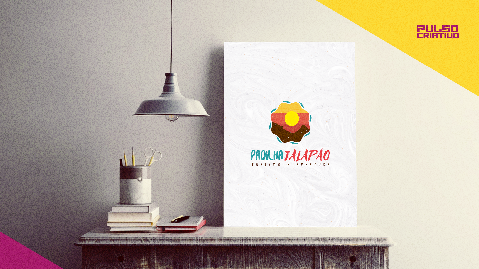
O símbolo central é uma composição geométrica que organiza os elementos fundamentais da região em um sistema coeso.
O símbolo central é uma composição geométrica que organiza os elementos fundamentais da região em um sistema coeso.
Contorno Orgânico: A forma ondulada representa o movimento das águas e a fluidez das dunas sob o vento.
Centro Solar: O sol centralizado atua como uma âncora visual, evocando o calor e a energia do cerrado tocantinense.
Camadas de Paisagem: A sobreposição de cores representa a transição do solo terroso para o horizonte vibrante, capturando o icônico pôr-do-sol da região.
Cromatismo e Tipografia
Paleta de Cores: Utilizamos uma combinação de tons quentes (laranja e marrom) para simbolizar a terra e a aventura, equilibrados por um turquesa refrescante que remete aos fervedouros.
Contraste Tipográfico: A tipografia script em "Jalapão" traz a vibração e o movimento da experiência off-road, enquanto a fonte sans-serif em "Padilha" e "Turismo e Aventura" confere a legibilidade e o profissionalismo exigidos por um guia de elite.
\\\
Ficha Técnica
Agência: Pulso Criativo
Cliente: Padilha Jalapão
Cliente: Padilha Jalapão
Direção de Criação e de Arte: Pedro Márcio Di Pietro
Redação: Pedro Márcio Di Pietro
Atendimento: Pedro Márcio Di Pietro
STATUS: Aprovada
_
_